

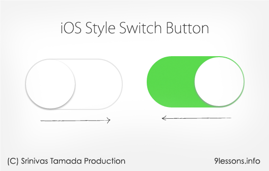
I said earlier the mobile revolution has been started, now time to build mobile web application for your web projects. Many third party platforms like Apache Cordova and Phonegap are offering that you can convert web application into native mobile application. This tutorial will help you how to design iOS style switch button component using HTML, CSS and Jquery. Specially I love CSS :before and :after pseudo-elements, this helps you to minimize the HTML code.
 Download Script
  Live Demo
Note: For better result, use Chrome, Firefox and Safari browsers.
HTML Code
Simple HTML code, you should include checkbox and switch DIV inside label tag.
<label>
<input type="checkbox" name="checkboxName" class="checkbox"/>
<div class="switch"></div>
</label>
<input type="checkbox" name="checkboxName" class="checkbox"/>
<div class="switch"></div>
</label>
Switch Container
Simple HTML code,
.switch
{
width: 62px;
height: 32px;
background: #E5E5E5;
z-index: 0;
margin: 0;
padding: 0;
appearance: none;
border: none;
cursor: pointer;
position: relative;
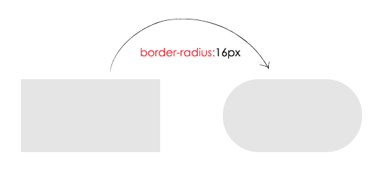
border-radius:16px; //IE 11
-moz-border-radius:16px; //Mozilla
-webkit-border-radius:16px; //Chrome and Safari
}
{
width: 62px;
height: 32px;
background: #E5E5E5;
z-index: 0;
margin: 0;
padding: 0;
appearance: none;
border: none;
cursor: pointer;
position: relative;
border-radius:16px; //IE 11
-moz-border-radius:16px; //Mozilla
-webkit-border-radius:16px; //Chrome and Safari
}
After applying border-radius code.
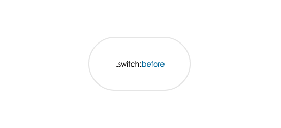
Switch Before
The :before is a pseudo-element, insert style/content before DOM element.
.switch:before
{
content: ' ';
position: absolute;
left: 1px;
top: 1px;
width: 60px;
height: 30px;
background: #FFFFFF;
z-index: 1;
border-radius:16px; //IE 11
-moz-border-radius:16px; //Mozilla
-webkit-border-radius:16px; //Chrome and Safari
}
{
content: ' ';
position: absolute;
left: 1px;
top: 1px;
width: 60px;
height: 30px;
background: #FFFFFF;
z-index: 1;
border-radius:16px; //IE 11
-moz-border-radius:16px; //Mozilla
-webkit-border-radius:16px; //Chrome and Safari
}
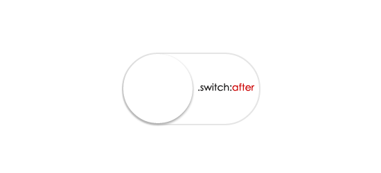
Switch After
The :after is a pseudo-element, insert style/content after DOM element. Here transition duration helps to enrich animation effect.
.switch:after
{
content: ' ';
height: 29px;
width: 29px;
border-radius: 28px;
z-index: 2;
background: #FFFFFF;
position: absolute;
-webkit-transition-duration: 300ms;
transition-duration: 300ms;
top: 1px;
left: 1px;
-webkit-box-shadow: 0 2px 5px #999999;
box-shadow: 0 2px 5px #999999;
}
{
content: ' ';
height: 29px;
width: 29px;
border-radius: 28px;
z-index: 2;
background: #FFFFFF;
position: absolute;
-webkit-transition-duration: 300ms;
transition-duration: 300ms;
top: 1px;
left: 1px;
-webkit-box-shadow: 0 2px 5px #999999;
box-shadow: 0 2px 5px #999999;
}
Read more about Text Shadow Effects tutorial.
SwitchOn :after :before
Applying the background color to green and moving
.switchOn , .switchOn:before
{
background: #4cd964 !important;
}
.switchOn:after
{
left: 21px !important;
}
{
background: #4cd964 !important;
}
.switchOn:after
{
left: 21px !important;
}

JQuery
Contains JavaScript code, $('.switch').click(function(){} - switch is the class name of the DIV. Using jquery toggleClass adding and removing switchOn class based on click action.
<script src="http://ajax.googleapis.com/ajax/libs/jquery/2.1.1/jquery.min.js"></script>
<script>
$(document).ready(function()
{
$('.switch').click(function()
{
$(this).toggleClass("switchOn");
});
});
</script>
<script>
$(document).ready(function()
{
$('.switch').click(function()
{
$(this).toggleClass("switchOn");
});
});
</script>
Final CSS
You can hide input checkbox using display:none.
.checkbox{display:none}
.switch
{
width: 62px;
height: 32px;
background: #E5E5E5;
z-index: 0;
margin: 0;
padding: 0;
appearance: none;
border: none;
cursor: pointer;
position: relative;
border-radius:16px; //IE 11
-moz-border-radius:16px; //Mozilla
-webkit-border-radius:16px; //Chrome and Safari
}
.switch:before
{
content: ' ';
position: absolute;
left: 1px;
top: 1px;
width: 60px;
height: 30px;
background: #FFFFFF;
z-index: 1;
border-radius:16px; //IE 11
-moz-border-radius:16px; //Mozilla
-webkit-border-radius:16px; //Chrome and Safari
}
.switch:after
{
content: ' ';
height: 29px;
width: 29px;
border-radius: 28px;
background: #FFFFFF;
position: absolute;
z-index: 2;
top: 1px;
left: 1px;
-webkit-transition-duration: 300ms;
transition-duration: 300ms;
-webkit-box-shadow: 0 2px 5px #999999;
box-shadow: 0 2px 5px #999999;
}
.switchOn , .switchOn:before
{
background: #4cd964 !important;
}
.switchOn:after
{
left: 21px !important;
}
Video Tutorial


Thanks for nice tutorial.
ReplyDeleteIn live demo, double clicking on switch is malfunctioning. Checkbox not turn on and off accordingly.
Superb Yar, its awesome tutorial :) i like it and will try to implement it into my backend for status active / inactive purpose
ReplyDeleteNice one I really liked it :) easy to understand
ReplyDeleteNice script :)
ReplyDeletenice
ReplyDeleteNice! trick for using phonegap hehe...
ReplyDeletecool buttons
ReplyDeleteThat's amazing.
ReplyDeleteIOS should be upgraded?
ReplyDeleteIt looks really awesome! Keep up the good work. :)
ReplyDeleteNice.. Its worked..
ReplyDeleteWoW! What a beautiful design. I'll sure try this.
ReplyDeleteTnx admin
ReplyDeleteWhat a tutorial. I really liked it. I also make tips in my blog http://ahsancy.com. But you are something bro. That's why I like your blog so much
hi,
ReplyDeletecan i add multiple switch on same page using same class??? or i need it assign different class for each switch?
Nice Script
ReplyDeleteit;s possible that auto chek swice on or off?
ReplyDeleteI have a pure CSS/HTML version - inspired by you, but tweaked to do away with the need for JQuery. By putting the label after the input element, and using the ':checked' pseudo selector - you can style the label to look like the slide button based on the status of the preceeding input.
ReplyDeleteMy Version is here : https://jsfiddle.net/TonyFlury/dqLgk53d/1/
The code in this page and demo is little different. I copied from demo page. This once have small bug in length. Check it
ReplyDelete