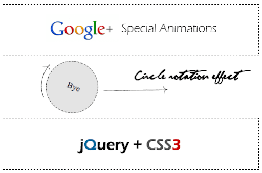
Google plus given an awesome kick to user experience, specially circles UI animations. I feel it’s great and new definition to have user experience design. I have tried circle rotation animation effect with Jquery and CSS3. Just few lines of code applying CSS styles using jQuery methods like .addClass() and .animation(). Take a look at these live demos with modern brewers.

For best result try with Chrome browser.
 Live Demo 1
  Live Demo 2
  Live Demo 3
Javascript Code
$(".square").click(function(){})- square is the class name of DIV tag. Using $(this).animation() and $(this).addClass() - applying animation and class styles.
<script type="text/javascript" src="http://ajax.googleapis.com/
ajax/libs/jquery/1.5/jquery.min.js"></script>
<script type="text/javascript" src="easing.min.js"></script>
<script type="text/javascript">
$(document).ready(function()
{
$(".square").click(function()
{
$(this).animate({width:'100px',height:'100px'}, 500, 'linear', function()
{
$(this).addClass('circle-label-rotate');
}).addClass('circle').html('<div class="innertext">Bye</div>').animate({"opacity":"0","margin-left":"510px"},1500);
$(this).slideUp({duration: 'slow',easing: 'easeOutBounce'}).hide();
});
});
</script>
//HTML Code blocks
<div class='square'> 1</div>
<div class='square'> 2</div>
<div class='square'> 3</div>
Circle
CSS3 circle diameter 50px
.circle
{
border-radius: 50px; // Chrome & IE9
-moz-border-radius: 50px; // Firefox
-webkit-border-radius: 50px; // Safari
height:100px;
width:100px;
background:#dedede;
}
{
border-radius: 50px; // Chrome & IE9
-moz-border-radius: 50px; // Firefox
-webkit-border-radius: 50px; // Safari
height:100px;
width:100px;
background:#dedede;
}
Rotation
CSS3 rotating 0 - 360 degrees
@-webkit-keyframes rotateThis
{
from {-webkit-transform:scale(1) rotate(0deg);}
to {-webkit-transform:scale(1) rotate(360deg);}
}
.circle-label-rotate
{
-webkit-animation-name: rotateThis;
-webkit-animation-duration:2s;
-webkit-animation-iteration-count:infinite;
-webkit-animation-timing-function:linear;
}
{
from {-webkit-transform:scale(1) rotate(0deg);}
to {-webkit-transform:scale(1) rotate(360deg);}
}
.circle-label-rotate
{
-webkit-animation-name: rotateThis;
-webkit-animation-duration:2s;
-webkit-animation-iteration-count:infinite;
-webkit-animation-timing-function:linear;
}
Square
Contains CSS code.
.square
{
height:100px;
width:500px;
border:dashed 1px #000;
margin-top:10px;
}
{
height:100px;
width:500px;
border:dashed 1px #000;
margin-top:10px;
}


Very Nice Srinu...
ReplyDeleteCool tutorials,
ReplyDelete:)
ReplyDeleteFirefox5 is supporting CSS3 Animations too, so you can add @-moz-keyframes ... with -moz- prefixes to your tutorial.
ReplyDeleteWhat a Great work guy :) i love it :)
ReplyDeletecooL
ReplyDeletegud one you can do in firefix too.....
ReplyDeleteWow! this is amazing!
ReplyDeleteCan't wait til we can do this stuff across all browsers.
ReplyDeleteI do not like this effect, I think it has no content.
ReplyDeleteBut... is cool.
Demo 2 consistently crashes Chrome on OSX, I have not profiled it yet but it seems like there is a memory issue.
ReplyDeleteThis is awesome. this is really cool in the eyes. realized that if the image dimension is larger than 80 by 80, the rolling effect gets out of hand and almost scramble the effect 4 me.
ReplyDeleteHow can i fix that ?
Thats nice to know.. good tut again..
ReplyDeletewow!!! awasome!!! working perfect in Mozilla, Effects not working in IE-9.
ReplyDeletevery nice...
ReplyDeletewow,, nice it's cool ...
ReplyDeleteGreat work
ReplyDeletevery nice features to add to our app
ReplyDeleteNICE AND SIMPLE, THX!
ReplyDeletenice post
ReplyDeleteawesome...
really cooool...
This is amazing.
ReplyDeleteSomething very interesting, Google plus has emerged with the new phase of graphics in social media websites.
ReplyDeleteLive demo helps to get quick overview of whole post and Your tutorial is very easy to use :)
This is amazing! Thanks a lot!!!
ReplyDeleteThis is very nice.
ReplyDeletecool~
ReplyDeleteAwesome!!!
ReplyDeletenice..
ReplyDeleteit Awesome
ReplyDeleteThat's nice but where is php code ?
ReplyDeleteAnd also, the delete function takes more time. It is not as nice as the one of facebook :)
i like it...... :)
ReplyDeleteCircle not roatating in FireFox. Can you fix it?.
ReplyDeleteI really love your tutorials. You are amazing!
ReplyDeleteNow Adobe released ADOBE EDGE to do more animation with Jquery, HTML5 and CSS3. follow the URL http://labs.adobe.com/technologies/edge/
I have posted in my blog
www.tamiltuts.com
simple example, google plus add friends circle animation, http://jgaibory.webuda.com/static/test/gplus-circle
ReplyDeletenice one. cool apps. thanks
ReplyDeleteNice article. It helps me very much in my project keep it up.Thanks
ReplyDeleteAwesome
ReplyDeletecool ...
ReplyDeletecould you teach me ??
you are brilliant :)
ReplyDeleteyou are really genius....:)
ReplyDeleteExcelente...muchas gracias!!
ReplyDeleteGreat, its seems very nice. I hope i will see in daily blogging. I really appreciate your work. I am going to be a daily visit od 9lessons now. :P
ReplyDeletecool. but you need to get it working on all browsers. IE is not dead for regular users
ReplyDeletewhere i can get easing.min.js?
ReplyDeletehttp://demos.9lessons.info/eas.js
ReplyDeleteBy this url u can get that js..
Wow!! awesome.. really helpful!
ReplyDeleteSrinivas, you deserve appreciation for this article.
ReplyDeleteA person necessarily lend a hand to make significantly posts I would state. That is the very first time I frequented your web page and to this point?
ReplyDeleteNice beginners learning guide for css and jquery!appreciate your work!
ReplyDeleteNice tips. Thanks for sharing such a nice post.
ReplyDelete