

Are you interested to create and publish NPM packages/libraries to enrich Angular functionality? Take a quick look at this post. You can share solutions with other developers. A simple package can solve many problems and resolve the issue quickly. If you are working with multiple applications? Package approach will help you to solve the components problems easily. In this post I have created the Bootstrap confirm functionality package with control options and published it on NPM repository for global use.
Live Demo
NPM Package - NgxBootstrapConfirm
GitHub Source
Getting started
Use the Angular CLI to generate a new library skeleton with the following command. Using --create-application=false avoiding to create a regulate application.
$ng new ngx-bootstrap-confirm --create-application=false
Project Directory
Change the directory.
$cd ngx-bootstrap-confirm
Generate a library
Here my library name is ngx-bootstrap-confirm. Try to use unique name for better NPM search result.
ng generate library ngx-bootstrap-confirm
Bootstrap
We need Bootstrap for parent source.
npm install ngx-bootstrap
Library Package
You have to include the peerDependencies in library package file.
projects/ngx-bootstrap-confirm/package.json
{
}
"name": "ngx-bootstrap-confirm",
"version": "3.0.1",
"peerDependencies": {
"@angular/common": "^9.1.3",
"@angular/core": "^9.1.3",
"tslib": "^1.10.0",
"ngx-bootstrap": "^5.6.1"
}
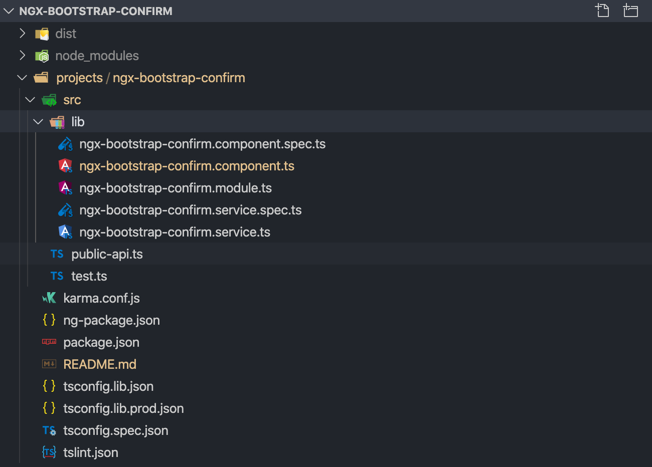
Project Library Structure
ngx-bootstrap-confirm.component.ts
Created a component for Bootstrap confirm. Here I have provided options for confirm message title and buttons names. Modified confirm and decline method default responses.
import { Component } from '@angular/core';
import { BsModalRef } from 'ngx-bootstrap/modal';
@Component({
selector: 'lib-ngx-bootstrap-confirm',
template:`
<div class="confirm modal-body">
<div class="content" [innerHTML]="title"></div>
<div class="buttons">
<button type="button" class="btn btn-success" (click)="confirm()" [innerHTML]="confirmLabel"></button>
<button type="button" class="btn btn-danger" (click)="decline()" [innerHTML]="declineLabel"></button>
</div>
</div>
`
})
export class NgxBootstrapConfirmComponent {
title: string;
confirmLabel: string;
declineLabel: string;
constructor(public bsModalRef: BsModalRef) {}
confirm() {
if (this.bsModalRef.content.callback != null) {
this.bsModalRef.content.callback(true);
this.bsModalRef.hide();
}
}
decline() {
if (this.bsModalRef.content.callback != null) {
this.bsModalRef.content.callback(false);
this.bsModalRef.hide();
}
}
}
ngx-bootstrap-confirm.service.ts
Create a service for showing confirm dialog modal. This method will resolve the promise based on the user action.
import { Injectable } from '@angular/core';
import { BsModalRef, BsModalService } from 'ngx-bootstrap/modal';
import { NgxBootstrapConfirmComponent } from './ngx-bootstrap-confirm.component';
@Injectable()
export class NgxBootstrapConfirmService {
modalRef: BsModalRef;
constructor(private modalService: BsModalService) {}
confirm(options: any): Promise<any> {
return new Promise((resolve, reject) => {
this.modalRef = this.modalService.show(NgxBootstrapConfirmComponent, {
initialState: {
title: options.title,
confirmLabel: options.confirmLabel,
declineLabel: options.declineLabel,
callback: (result: boolean) => {
resolve(result);
},
},
});
});
}
}
ngx-bootstrap-confirm.module.ts
Import and export the confirm component and include the service for external use. This module is key import for other projects to access this methods.
import { NgModule } from '@angular/core';
import { ModalModule } from 'ngx-bootstrap/modal';
import { NgxBootstrapConfirmComponent } from './ngx-bootstrap-confirm.component';
import { NgxBootstrapConfirmService } from './ngx-bootstrap-confirm.service';
@NgModule({
declarations: [NgxBootstrapConfirmComponent],
imports: [ModalModule.forRoot()],
exports: [NgxBootstrapConfirmComponent],
providers: [NgxBootstrapConfirmService],
})
export class NgxBootstrapConfirmModule {}
NPM Package and Publish
NPM Repository Authentication
Create an account for npmjs.com/. Use the following command to authenticate.
$npm login
Production Build
Now build the package and change the package.json version number for every build.
$ng build ngx-bootstrap-confirm --prod
NPM Publish
Go to the distribution(dist) package folder and execute npm publish command.
$cd dist/ngx-bootstrap-confirm
$npm publish
$npm publish
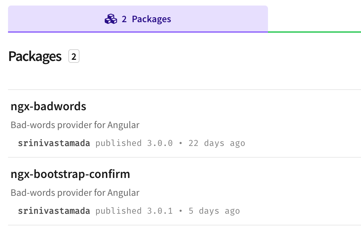
Find the package in your profile page.
How to use NgxBootstrapConfirm?
NPM 6 Installation
For NPM version 6 need a peerDependency.
npm install --save ngx-bootstrap ngx-bootstrap-confirm
NPM 7
NPM version 7 will automatically install the peerDependencies packages.
npm install --save ngx-bootstrap-confirm
Yarn install
yarn add ngx-bootstrap ngx-bootstrap-confirm
app.module.ts
Angular project import the NgxBootstrapConfirmMoodule to access the library methods.
import { BrowserModule } from '@angular/platform-browser';
export class AppModule { }
import { NgModule } from '@angular/core';
import { NgxBootstrapConfirmModule} from 'ngx-bootstrap-confirm';
import { AppRoutingModule } from './app-routing.module';
import { AppComponent } from './app.component';
@NgModule({
declarations: [
AppComponent
],
imports: [
BrowserModule,
AppRoutingModule,
NgxBootstrapConfirmModule
],
providers: [],
bootstrap: [AppComponent]
})
app.component.ts
Import the NgxBootstrapConfirmService to display the confirm dialog modal with options objects.
import { Component } from '@angular/core';
import { NgxBootstrapConfirmService } from 'ngx-bootstrap-confirm';
@Component({
selector: 'app-root',
templateUrl: './app.component.html',
styleUrls: ['./app.component.scss'],
})
export class AppComponent {
result: string;
constructor(private ngxBootstrapConfirmService: NgxBootstrapConfirmService) {}
action() {
this.result ='';
let options ={
title: 'Sure you want to delete this?',
confirmLabel: 'Okay',
declineLabel: 'Cancel'
}
this.ngxBootstrapConfirmService.confirm(options).then((res: boolean) => {
if (res) {
console.log('Confirmed');
this.result = 'Confirmed';
} else {
console.log('Declined');
this.result = 'Declined';
}
});
}
}
style.scss
Apply styles and modify the confirm modal design. You have to import Bootstrap css for better result.
.modal-dialog {
width: 360px !important;
margin-top: 120px;
margin: 30px auto;
.modal-content {
box-shadow: 0 5px 15px rgba(0, 0, 0, 0.5);
}
.confirm {
box-shadow: 0 2px 6px rgba(0, 0, 0, 0.2);
border-radius: 5px;
min-height: 150px;
.content {
padding: 20px;
border-radius: 10px;
background-color: #fff !important;
font-weight: 700;
}
.buttons {
padding: 10px 15px;
float: right;
button {
margin-right: 10px;
}
}
}
}


hi this is really good content. please keep it sharing.
ReplyDeleteThis comment has been removed by a blog administrator.
ReplyDelete